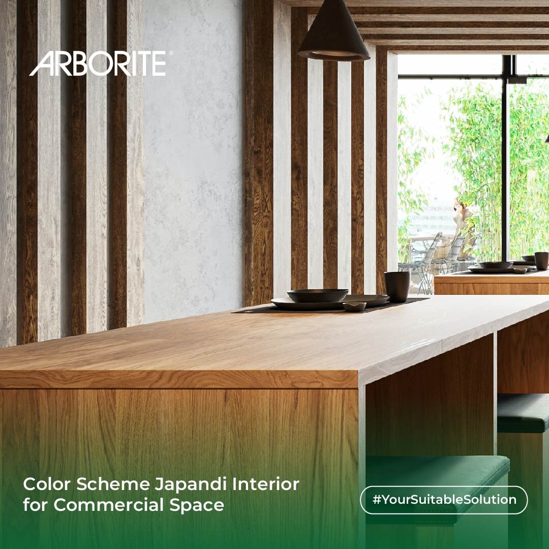
Japandi interior design is a fusion of Japanese minimalism and Scandinavian simplicity, combining the natural, clean lines of both styles. When choosing a color scheme for a Japandi commercial interior, it’s important to focus on colors that are calming, harmonious, and earthy.
Here are some color scheme ideas for a Japandi commercial interior:
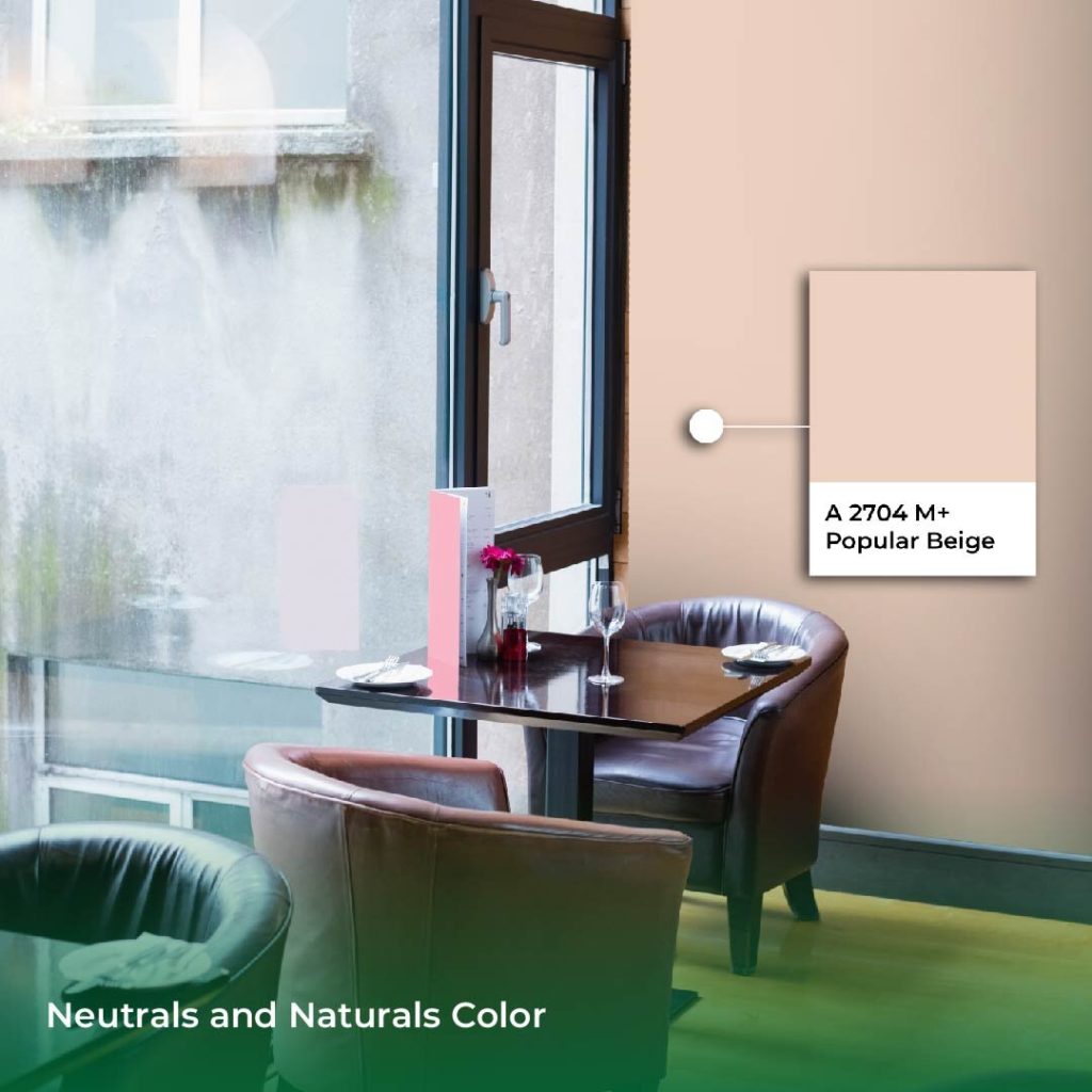
Neutrals and Naturals
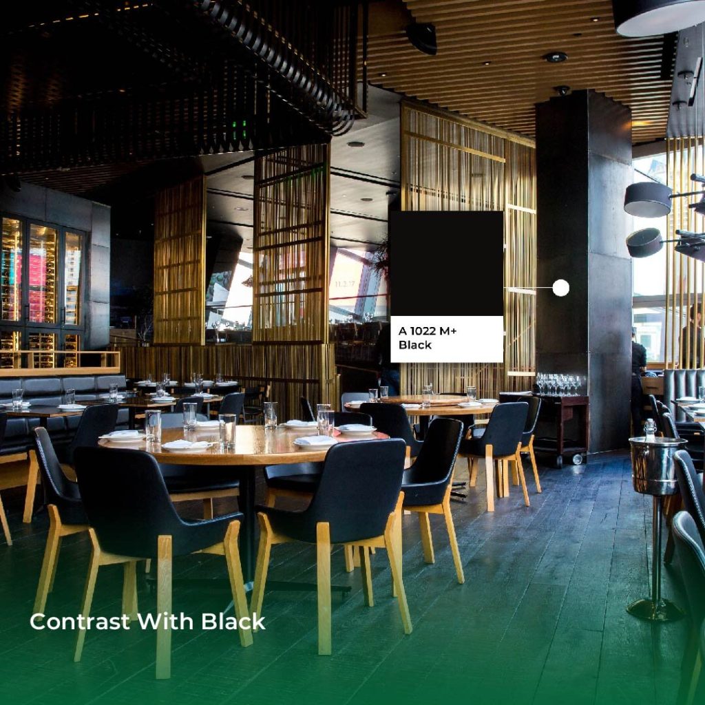
Contrast with Black
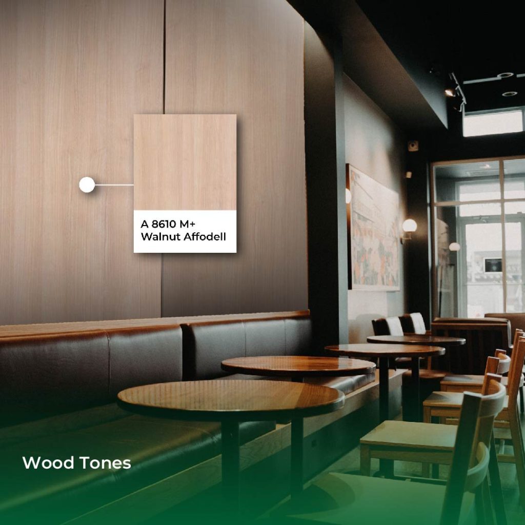
Wood Tones
Accents of Color
In Japandi interior design, it’s essential to keep the space minimalistic. Still, you can add accents of color through small decor pieces, such as plants, pottery, or artwork, in muted or earthy tones to maintain the overall calming effect of the space.
Remember that the key to a Japandi interior is keeping it simple, harmonious, and relaxing. By using calming and earthy tones, you can achieve a commercial interior that is both functional and visually appealing.
Find more inspiration here or contact us for more information.